Showing posts with label Theory. Show all posts

Monday, November 23, 2009

Unity, Harmony, and Contrast in Blackwork

Figure 1
line drawings of a woman, a pomegrante, and a fish.


In design theory the concept of unity is the almighty peg on which the rest of the principles turn. Unity in design is the resting place of art. It is where all good art stands and is revealed. Almost all artists have an innate knowledge of unity and how it is created within a work of art. Indeed, that may be one of the mainstays of an artist. But sometimes unity is a hard thing to understand and to visualize. Unity is the coming together of all the various parts to create a coherent whole. In figure 1 there are three objects, a fish, a woman, and a pomegranate. Though there is some similarity between them (they are all line drawings in black and white; they are all depictions of living things), there is no real unity among them. But look at figure 2. It is also a line drawing in black and white. This drawing has unity: unity in the series of circles and ovals that make up the majority of the lines; the unity of similar objects, the apples, being featured in the depiction, and the leaves; and last, the black line drawn all the way around it bringing borders to the work.

Figure 2
line drawing of a plate of apples

Contrast and harmony play a big role in the development of unity in a piece of art. Contrast is the differences among the elements in the piece. And harmony is the similarities between them. A piece of all contrast and very few, if any, harmonies is not a good piece of art. That we see in figure 1. In both figures we have the contrast of the black ink and the white page. In figure 1 we have many contrasts and few harmonies.

Harmony within a work helps the feeling of unity. In the case of figure 2, the harmonies are the circles, the harmony of the idea of a plate of fruit with no other distractions, the harmony of the simplicity of it. But in Figure 1 there are fewer harmonies. No one shape takes precedence over other shapes. The objects are as far apart on the page as they can be leading more to disharmony. There is really nothing similar among them.

But beware! A piece with too many harmonies seems dull and lifeless--nothing catches the eye and the brain of the beholder. Contrast must work with harmony to achieve harmony. Contrast is the spice in the pie.

Blackwork comes with built-in harmonies and contrasts. Blackwork is stitching of a particular type using very few variants of stitches. This is an automatic harmony. But just this alone will not give overall unity to the piece. Take a look at Earl Grey, a blackwork that has unity, harmony, and contrast. See if you can pick out instances of each of these within its borders.


Earl Grey
Blackwork with a pulled work background in white.
10" X 10" black silk on white linen

Clouds on the Platte
or Nebraska
by Ann Erdmann
blackwork in colors

Ann Erdmann has finally sent me a picture of her finished work, Clouds over the Platte. It is hard for me to believe that this is only her third piece of blackwork she has done, but I know it is.

Thursday, November 12, 2009

Swirling Patterns

From the sampler for Intense Pattern:
two borders and corners
(plus pieces of vine and leaf);
part of patterning theory we will be learning.


Flowers and elephants in translation;
also from the sampler,


Borders and an overlay from the sampler;
from the top: a Celtic-style border; a line of rabbits in three configurations;
teapots and tea cups;
a non-repeating border called Excission from the title of a book by that name;
and to the left an overlay in two colors.


From a blackwork called Bittersweet, a void study
.


From the sampler Japanese Ribbons, "reeds reflected in water"
from an old kimono pattern.


From Japanese Ribbons, a pattern of bats done in half drop.


From The Crazed Sampler, a study in reverse images.


From The Crazed Sampler, study in scope/size.


From The Crazed Sampler, an overlay in black and gray with a diamond border to the left.


The Crazed Sampler, a tesselation--Escher's birds.


I think the reason that blackwork is so popular is that it is like a puzzle. How do those patterns fit together? How can I get the patterns to seem to revolve and evolve? The brain is immediately engaged in its exploration of the wendings and windings of a complex pattern and the puzzle it represents.
How can we achieve that complex blackwork look? By the study of patterning theory as it has to do with blackwork. That is what the class, Intense Pattern, is all about. Patterning theory is a little known and little studied part of design theory. Design theory is a huge category of study that encompasses everything from how to make films for cinema, to how to make Windsor chairs, how to design repeating wallpaper to how to make baskets, etc., etc., etc. It also includes how to compose pictures for art, color theory, and how to make blackwork patterns that whirl and convolute. A person could study design theory for a life's work and still have more to do.
But like everything else, design theory and patterning theory can be learned one step at a time. As we will do it in Intense Pattern. There are "rules" to patterning that are fairly easy to learn and then to manipulate. This where the fun is--to study those rules and then make them work for us. Design theory, color theory, and patterning theory are just another language to learn--a lot easier than English or Mandarin or even French and Spanish, and a lot more accessible than FORTRAN or PL1. With even learning just a small part of the language of design, we can begin to use it and create with it.
The pilot class for Intense Pattern is full, but the real class to be held in Louisville, KY in July of 2010 is not full. If these words and these illustrations fascinate you, please consider coming with me to Louisville and entering this world of black and white, pattern and repeats.
Next time, some more on patterning theory.

Sunday, November 30, 2008

The Trouble With Red-Violet

The Twelve Part Color Wheel
starting at the top and going right is yellow, yellow-green, green,
blue-green, blue, blue-violet,violet, red-violet, red, red-orange,
orange, yellow-orange


While working on my previous blog post about the color brown, I was reminded of another color that has some interesting properties, red-violet. Red-violet is the warmest of the violets. Remember that the sun side of the color wheel is red, orange, and yellow, while the cool side is green, blue and violet. Red-violet is the warmest of the cool tcolors because it lies between red, certainly the color of the setting sun, and violet, the color of an evening sky, tender spring flowers, and the ocean in one of its moods.

The color wheel is based on the color spectrum, which is the rainbow that we see every summer. When light from the sun, called white light, passes through a prism, such as water droplets, or a special piece of glass, that white light is broken up or refracted into its component colors. So we see a rainbow divided into about seven hues: red, orange, yellow, green, blue, and violet. Red is always at the top or outside of the rainbow and violet is always at the bottom or inside of the rainbow. Colors are actually wave lengths on the radiant spectrum that includes radio waves, microwaves, gamma rays, and cosmic rays. Red is about 700 nanometers, the longest of the wavelengths of color, while violet is the 400 nanometer range. Above red is infra-red and below violet is ultraviolet. There is no space for red-violet, an "impossible" color. And yet we see red-violet in the color of fuchsias. lilacs, and water lilies. It's a mystery to me.

By the way, violet is that beautiful color between red and blue, while purple to me is a very dark version of violet. One of my favorite colors is blue-violet, an elusive color. It is one of the colors I look best wearing. When I was a child, I was the brown-haired, brown-eyed child, while my sister was the blue-eyed, dark-blonde. She always got to wear blue and I always got to wear brown. To this day, I do not like to wear brown and have only a jacket of that color in my wardrobe. Now I dress in blue, blue-violet, and red-violet. And my little sister? She still looks great in blue.

Friday, November 28, 2008

Brown Story

---for Karen---

In color theory brown has an amazing role. Before my study of color, I thought brown was, well, just brown. The color of dirt, of baked bread, of autumn leaves. It is all that and more. Brown is not just one color, but many.

Brown can be made by shading, that is adding black, to yellow, yellow-orange, orange, red-orange, and red. Simple enough.

Betty Edwards in her book, Color, uses the humble paper bag to illustrate brown as a mixture of three primaries. Her paper bag starts with a mixture of yellow and red in a two to one ratio to make an orange. She adds a lot of white. Then she adds a little blue and we get the tan of a paper bag. This tan is low in chroma, that is it has less pigment than the color wheel primaries. And it is low in value, that is it is lighter than any of the primaries. So brown can be made with all of the cool colors (blue, green, and violet) as well as the warm colors (yellow, orange, and red).

Tones--gray added to a color-- are many times a brown. If a lot of light gray is added to orange, we get a brown tone called beige. Beige is very low in chroma and very low in value, but still its hue is orange.

Other descriptive words for brown in addition to tan and beige are rust, khaki, ecru (a very light beige), sepia, and umber, just to name a few. Brown has meanings beyond the mixing of colors. Brown can symbolize gloominess and earthiness. Brown in the political arena of the thirties and forties was represented in Hitler's Brown Shirts. Brown is the color of baked bread, roasted meats, coffee and chocolate--very savory indeed. Brown is the color of November as fall slides into the whites and grays of winter.

Brown is one of the English "color words," the eleven elemental words that name colors. Those words are: Red, blue, yellow, green, blue, orange, black, white, gray, pink, and brown. Brown is the Everyman of color, useful and full of paradoxes.

Friday, October 3, 2008

Watermelon, Turquoise, and Slate


12 Part Color Wheel
This color wheel I drew for a paper I wrote a couple of years ago, done in colored pencil. The "mask" or pointers point to a tetrad color combination. The colors here are at full saturation for colored pencils.

In the last post I talked about hue, saturation, and value as aspects of color. Hue is the name of the color, for instance red, blue, or yellow. In English we have only eleven color names. All the rest of the colors are descriptions of the nine. So we have red, blue, yellow, green, orange, violet, pink, brown, and gray, white, and black. So watermelon red is a description of a particular pinky-red. Turquoise blue is a tag telling us where the blue mineral was mined and named. Purple describes the dye that is extracted from a certain eastern Mediterranean mollusk. Gray, black, and white are not considered hues at all, but merely darks and lights that can be used with any hue. In a sense, though, they are also "color" words.
Saturation is how much color or pigment is in a hue. The hues of the familiar twelve-part color wheel are supposed to always be at maximum saturation. Other words used also for saturation are intensity and chroma. So a color of low saturation would be slate blue, that is, a blue with a lot of gray added. The blueness of slate blue is less vivid or less intense than the full blue of the color on the color wheel.

Pastels are colors that are less intense. Pastel crayons are pure pigments that are bound together with gum or some other adhesive. These crayons have a beautiful light translucence to them. We think of pastels as tints of hues. Tints are hue with white added, so by definition tints have less chroma than the full hue. So now think of value that we talked about in the previous post. Value is how light or dark a color is. So a pastel color, for instance baby pink, is a red hue (after all, pink is red with a lot of white added), of low saturation, and a light value. So we have described the color!

Using only pastels in an article of embroidery, say a baby sampler, can be a problem. Light, delicate colors do seem just right for a baby, but if only light, delicate colors are used, then from a distance our sampler looks like gray-pink mud. For a sampler that people can actually see from five feet away, darks as well as lights should be used.
I do a lot of manipulating of photographs on my computer. One of the things I can do is to "super saturate" a photo. This mean that light can be packed in so that our normal color wheel hues, the ones that are supposed to be at full saturation already, are really bright. I have noticed that a couple TV shows shoot all their scenes in super-saturated mode. I see this most in CSI Miami (a show that I am not fond of, but not because of the super-saturation). Saturation is fun to play with in light on the computer, but as we stitch
"Merci Beaucoup"
4.5" X 6"
This is the original saturation of colors.
with our threads, it is almost impossible to achieve. And I am sure that I wouldn't like to see a lot of my stuff super-saturated anyway. After a while it has a decidedly artificial look to it.

"Merci Beaucoup"

4.5" X 6"
A small sampler done on perforated paper with Impressions threads.
This image has been artificially super-saturated

Wednesday, October 1, 2008

The Bees Reprise

The Bee Sampler (completed)
The wings are still light gray.
There are thirteen types of flowers that the bees are tending to.

For various reasons I am again looking at color in order to write about it and presumably teach it further down the line. And again I am struck by the power of value in any color composition.

Value is how light or dark a color is. For instance with the color blue, baby blue has a light value and navy blue has a very dark value. Easy enough.

In color theory, any color can be described by naming iits three of attributes. Hue is the name of the color it is, red, blue, orange, etc. Saturation is the amount of pigment in any color, or how colorful a color is. Lipstick red is more saturated than baby pink. Other words for saturation are intensity and chroma. And value, of course is how light or dark the color is. So lipstick red is red with high saturation and a medium value, being neither very dark or very light.

I have heard it said that the untrained human eye can see only four values in a composition at a time--the lightest, the darkest, and two middle values. If this is true, and I have no reason to disbelieve it, then we as artists, designers, and stitchers must get the values right in order to show the composition at its best.

In an earlier post I put up an embroidery of bees. My sister, Albie Merrill, suggested that the bees wings were not dark enough and she was right. I was not seeing the design because of my emotional involvement in it. I was still "seeing" what was in my mind it should look like, not what it really looked like. Look at the two bee embroideries next to one another and see the difference value makes. I changed from a light gray thread to a black thread to outline the bees's wings.

PJ's Bees
The upper example has the restitched wings, from light gray to black outlining.
The lower example shows the original gray. Of course this no longer exists except in electrons.

My friend Rita Curry-Pittman noticed that I had the same light gray wings on the now-completed sampler. She told me to change that as soon as I could. I have not yet gotten around to it, but here is the (almost) completed sampler that I showed just in the beginning phase in an earlier post.

So I guess I have two points to make in this post. One is that value has to be carefully considered in each composition. If something in the composition is a little off, it may be that a value is wonky and needs amending. Value is a powerful force within design. The other is that most artists need a cooling off period from their artwork in order to see it unemotionally. My cooling off period can be as long as a couple of months. If I have the time, I like to put a completed picture away for a period of time. When I bring it out again I can look at it with new eyes.

Sunday, August 17, 2008

The Sacred Stitch and Carnegie Hall

Earlier this week I was sitting and stitching with a group of friends. One of my friends, Addy, was learning some particularly finicky whitework fillings. She looked up from her work that she had been swearing at (I stitch with a rough group of women!) and said that her teacher had told them to use a doodle cloth to learn the stitches before putting them into the sampler. But Addy said that she never did doodle cloths and rarely practiced.

I should have been shocked and amazed at this statement, but I am not. I have known a lot of stitchers who do not practice on a doodle cloth, but who go right to the good piece. And confessorily, I have been known to do it myself. On the other hand, I have a dozen notebooks and a couple of storage bins that are filled with bits and pieces of practice pieces. I like to practice and to get it right. I don't want to take the moral high ground here, but I think even the most accomplished star of embroidery must practice.

So I asked Addy why she didn't work first on a doodle cloth. She said that she didn't want to waste any of her work. That she put a lot of effort into the stitches and she didn't like to see any trashed at the end. I didn't explain to her about my dozen notebooks and my two storage bins, because I know what she is talking about. When I started out in this medium, I wanted everything I did to count. I wanted everything I did to be perfect the first time. Amazingly, a lot of the stuff I did looked pretty good, so I was happy.

Then I started to be ambitious and decided to go for teacher certification in counted work from EGA. It was rough and at one point the certification committee asked me if I didn't want to quit and try again when I was more experienced. Well, no, I didn't want to quit, I knew I could do whatever they required of me. So a great lady, Rosemary Cornelius, stepped in and offered to help me out. Part of the problem was that I was living in Sandy, Utah at the time and was quite isolated from the certification committee who lived no further west than Philadelphia. The only access I had to them was by telephone and correspondence.

So Rosemary started mentoring me. She sent me a dozen small stitched examples on a dozen different fabrics to show me what was what. It was then I realized that even the best needlewomen practiced; that even I should practice. I made it through certification within two years (at that time, that was as long as it could take) and my work started to attract attention. The one good thing about not being in the pocket of the East Coast was that my work was fundamentally different.

So why The Sacred Stitch? I have learned that not everything that comes from my needle is a world statement and has to be saved. Even if things look good at first glance doesn't mean it can't be improved with practice. Now when I do mixed media embroidery for exhibit and for sale, the stitches aren't the calm, pristine things to be looked at and admired. The stitches are the building blocks of the whole piece. The stitches aren't as important as the finished whole. I can make a dozen perfect dove's eyes and then paint over them or melt nylon over them. But I do know how to make perfect dove's eyes because I practiced.

A man in the back of a limo had his driver stop on a street corner in New York. He rolled down his window and asked a passerby how to get to Carnegie Hall. The man looked at the limo and thought for a few seconds and then said, "Practice, practice, practice."

Friday, August 15, 2008

Desnudo and Grotesque


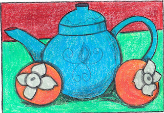
Persimmons and Teapot
colored pencil sketch
17 December 2007


When I decided to be a professional embroidery teacher and designer in the early 80s, I tried to equip myself with the tools I needed to be effective. I studied every type of embroidery I could with the best teachers I knew of. I looked at those teacher's written instructions; I learned how to use a computer and word processing software; and I practiced illustrating stitch diagrams. This served me for a long time and I was more successful as a teacher than I had ever expected to be.

All along not only was I stitching pieces for teaching, but I was also stitching pieces for my own enjoyment and explorations. I would enter the odd piece into art shows. It was while I was living in England, teaching there and also taking classes there, that I realized that I needed something more than what I was doing in order to really move ahead. It was around this time that I thought I could be an artist. I started studying design theory. Now I had already had an Individual Correspondence Course in design from EGA by Ann Harris and an ICC in color from Wilana Bristow, so I had some experience. But I really started to study design theory (color theory is just a part of design theory). The best way to study design is to teach it. Things were going pretty well. I was teaching a lot of color and design in and out of EGA. I was learning tremendous things about my own work and how to improve it. But I needed more.

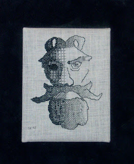
Have you ever had anyone tell you that as an artist or even as a designer, you need to know how to draw? People kept telling me this. But, really, I didn't need to know how to do that. I was a needlework designer and that doesn't need drawing. After all, look at my blackwork--done without formal training in drawing. Grotesque was done without a drawing or a graph. He was named after all the sculpture on buildings in England and France called gargoyles. A grotesque is a gargoyle without a waterspout.


Grotesque
Blackwork with silk thread on 32 count linen
stitched freehand


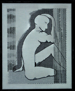
In September of 1996 I finally did what my mentors told me I would have to do: I enrolled in a beginning drawing class at my local community college in Littleton, Colorado. I was the oldest one in class including the instructor. I went to every class, I did all the assignments, and I learned. The nineteen-year-olds were all more experienced with the art of the pencil than I was, but I was certainly the most motivated. I came out a new person. Drawing doesn't so much teach a person how to use a pencil, it teaches a person how to SEE. I learned about shadows and edges, one-, two-, and three-point perspective. I learned how to draw the least little detail for authenticity in the drawing. The last class was a live model class and drawing the nude was a special treat. Out of this class meeting came Desnudo. Something I DREW.


Desnudo
Blackwork in silk thread on 28 count linen
from a live model


And so I am telling you now that in order to be a good artist, no matter how talented you might be on your own, you have to learn to draw. Since December 1996 when I left the class, I have been drawing. Certainly not every day, but there have been months when it has been just that. I draw as a treat and my drawings are a body of work apart from my needlework. I do colored pencil drawings, like the one here.

Because of my drawing, I have a lot more confidence in my work. I have a lot more authority in my teaching design and color theory. Learning to draw was such a gift that I gave myself--opening up a side of me that I didn't know existed. So--Learn To Draw!